Consumer Packaged Goods
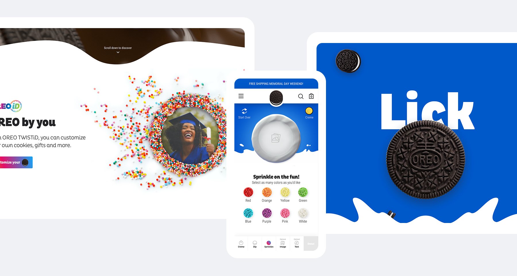
Digital Reboot & Personalization at Scale
Scroll ↓
Contributions
Art Direction
Icon Illustration
Product Design
For Born Group
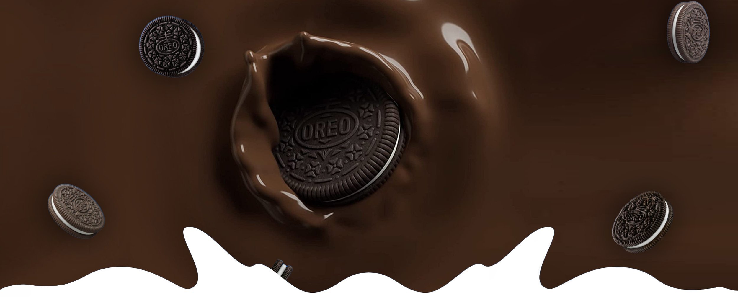
Watching a tidal wave of personalization wash over the e-commerce market, Oreo saw an opportunity to build a new product around its iconic cookie.
Consisting of two workstreams - the first was to combine the various Oreo URLs under one digital outpost and give it a fresh and engaging new look. The re-design of Oreo.com was produced by senior designer Lydia Ding with myself managing the art direction, internal syncs and design timelines. The second stream was to conceive, design, and introduce OreoID to the greater Oreo ecosystem. I led the OreoID visual design effort.

Oreo won 4 Webbys Awards for personalization and digital experience within the consumer packaged goods space. The Webbys honors excellence in 8 major media types: Websites/Mobile Sites, Video, Advertising, Media & PR, Social, Apps and Software, Games, Podcasts, and Virtual & Remote.
Senior UI Designer: Lydia Ding
Senior UX Designer: Beatrice Hunt Lynes and Melanie Hogan
People's Voice Winner
Websites and Mobile Sites - Food & Drink 2021

Webby Winner
Websites and Mobile Site - Food & Drink 2021
Webby Winner
Websites and Mobile Sites - Best Practices 2021
People's Voice Winner
Websites and Mobile Sites - Best Practices 2021


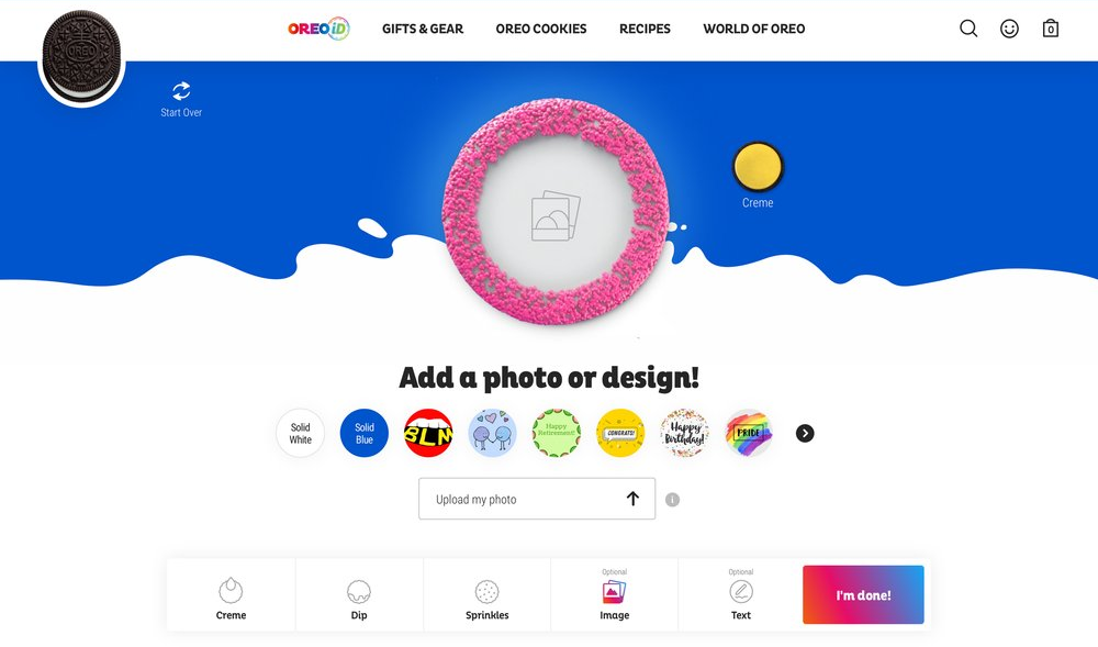


The Solution
To encourage creativity and playfulness — the core of the Oreo brand — the experience also needed to be fluid and unobtrusive. We spent hours mapping the possible flows, picking out dead loops and identifying the dependencies through the cookie creation journey.
After the architecture was laid out, we moved into visual design and continued to iterate upon the experience and design. We were also integral in digital brand strategy as this is the brand’s first fully digital product. Site revenues went up by as much as 500 percent after launch.
Color Palette

Primary
Secondary

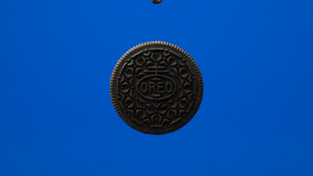
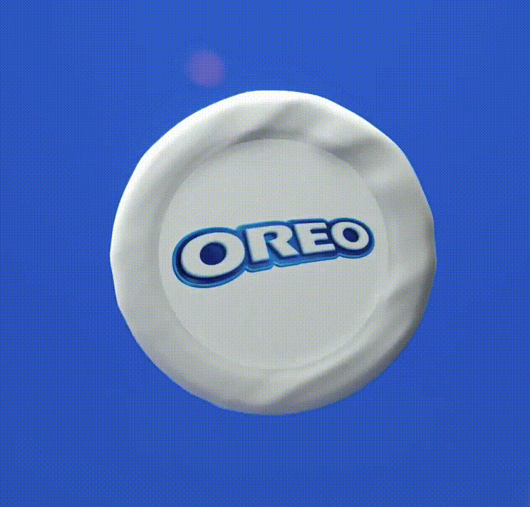
OreoID

Iconography
Default

Hover


